Position and layout of controls (xtd.forms)
In This Section
Overview
xtd.forms has in addition to layout containers three ways to manage the size and position of a control automatically:
Control placement in xtd.forms is determined not only by the control, but also by the parent of the control. This chapter describes the different settings provided by controls and the different types of parent containers that affect layout.
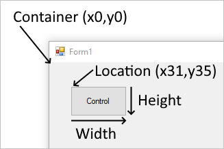
Fixed position and size
The position a control appears on a parent is determined by the value of the xtd::forms::control::location property relative to the top-left of the parent surface. The top-left position coordinate in the parent is (x0,y0). The size of the control is determined by the xtd::forms::control::size property and represents the width and height of the control.
When a control is added to a parent that enforces automatic placement, the position and size of the control is changed. In this case, the position and size of the control may not be manually adjusted, depending on the type of parent.
The xtd::forms::control::maximum_size and xtd::forms::control::minimum_size properties help set the minimum and maximum space a control can use.
Margin and Padding
There are two control properties that help with precise placement of controls: xtd::forms::control::margin and xtd::forms::control::padding.
The xtd::forms::control::margin property defines the space around the control that keeps other controls a specified distance from the control's borders.
The xtd::forms::control::padding property defines the space in the interior of a control that keeps the control's content (for example, the value of its xtd::forms::control::text property) a specified distance from the control's borders.
The following figure shows the xtd::forms::control::margin and xtd::forms::control::padding properties on a control.

Automatic placement and size
Controls can be automatically placed within their parent. Some parent containers force placement while others respect control settings that guide placement. There are two properties on a control that help automatic placement and size within a parent: xtd::forms::control::dock and xtd::forms::control::anchor.
Drawing order can affect automatic placement. The order in which a control is drawn determined by the control's index in the parent's Controls collection. This index is known as the Z-order. Each control is drawn in the reverse order they appear in the collection. Meaning, the collection is a first-in-last-drawn and last-in-first-drawn collection.
The xtd::forms::control::minimum_size and xtd::forms::control::maximum_size properties help set the minimum and maximum space a control can use.
Dock
Controls that are docked fill the edges of the control's container, either the form or a container control. For example, Windows Explorer docks its tree_view control to the left side of the window and its list_view control to the right side of the window. The docking mode can be any side of the control's container, or set to fill the remaining space of the container.
Examples
The following example shows the use of dock property :
#include <xtd/xtd>

using namespace xtd::forms;

class main_form : public form {
public:
  main_form() {
    controls().push_back_range({fill_button, bottom_button, top_button, right_button, left_button});
    size({800, 600});

    left_button.dock(dock_style::left);
    left_button.text("left");
    left_button.width(100);

    right_button.dock(dock_style::right);
    right_button.text("right");
    right_button.width(100);

    top_button.dock(dock_style::top);
    top_button.text("top");
    top_button.height(100);

    bottom_button.dock(dock_style::bottom);
    bottom_button.text("bottom");
    bottom_button.height(100);

    fill_button.dock(dock_style::fill);
    fill_button.text("fill");
  }

private:
  button left_button;
  button right_button;
  button top_button;
  button bottom_button;
  button fill_button;
};

auto main() -> int {
  application::run(main_form());
}
Controls are docked in reverse z-order and the Dock property interacts with the auto_size property. For more information, see Automatic sizing.
Anchor
When an anchored control's form is resized, the control maintains the distance between the control and the anchor positions. For example, if you have a text_box control that is anchored to the left, right, and bottom edges of the form, as the form is resized, the text_box control resizes horizontally so that it maintains the same distance from the right and left sides of the form. The control also positions itself vertically so that its location is always the same distance from the bottom edge of the form. If a control isn't anchored and the form is resized, the position of the control relative to the edges of the form is changed.
Example
The following example shows the use of anchor property :
#include <xtd/xtd>

using namespace xtd::forms;

class main_form : public form {
public:
  main_form() {
    controls().push_back_range({top_left_button, top_button, top_right_button, left_button, all_button, right_button, bottom_left_button, bottom_button, bottom_right_button});
    client_size({360, 130});
    minimum_client_size(client_size());
    text("form");

    top_left_button.location({10, 10});
    top_left_button.text("top-left");
    top_left_button.size({100, 30});

    top_button.location({130, 10});
    top_button.text("top");
    top_button.size({100, 30});
    top_button.anchor(anchor_styles::top);

    top_right_button.location({250, 10});
    top_right_button.text("top-right");
    top_right_button.size({100, 30});
    top_right_button.anchor(anchor_styles::top|anchor_styles::right);

    left_button.location({10, 50});
    left_button.text("left");
    left_button.size({100, 30});
    left_button.anchor(anchor_styles::left);

    all_button.location({130, 50});
    all_button.text("all");
    all_button.size({100, 30});
    all_button.anchor(anchor_styles::top|anchor_styles::left|anchor_styles::bottom|anchor_styles::right);

    right_button.location({250, 50});
    right_button.text("right");
    right_button.size({100, 30});
    right_button.anchor(anchor_styles::right);

    bottom_left_button.location({10, 90});
    bottom_left_button.text("bottom-left");
    bottom_left_button.size({100, 30});
    bottom_left_button.anchor(anchor_styles::bottom|anchor_styles::left);

    bottom_button.location({130, 90});
    bottom_button.text("bottom");
    bottom_button.size({100, 30});
    bottom_button.anchor(anchor_styles::bottom);

    bottom_right_button.location({250, 90});
    bottom_right_button.text("bottom-right");
    bottom_right_button.size({100, 30});
    bottom_right_button.anchor(anchor_styles::bottom|anchor_styles::right);
  }

private:
  button top_left_button;
  button top_button;
  button top_right_button;
  button left_button;
  button all_button;
  button right_button;
  button bottom_left_button;
  button bottom_button;
  button bottom_right_button;
};

auto main() -> int {
  application::run(main_form());
}
Automatic sizing
xtd::forms::control::auto_size property defines a value that indicates whether the control resizes based on its contents.
The auto_size property is combined with the auto_size_mode property.
Possible values for auto_size_mode :
- xtd::forms::auto_size_mode::grow_and_shrink : The control grows or shrinks to fit its contents. The control cannot be resized manually.
- xtd::forms::auto_size_mode::grow_only : The control grows as much as necessary to fit its contents but does not shrink smaller than the value of its size property. The form can be resized, but cannot be made so small that any of its contained controls are hidden.
By default controls have auto_size_mode::auto_size_mode::grow_and_shrink except all button types, form, group_box, panel and user_control which are set to xtd::forms::auto_size_mode::growing_only.
Example
For example if a form contains three controls and we set the auto_size property of the form to true, then the size of the form will adapt to encompass the three controls.
#include <xtd/xtd>

using namespace xtd::forms;

class main_form : public form {
public:
  main_form() {
    auto_size(true);
    auto_size_mode(xtd::forms::auto_size_mode::grow_and_shrink);
    controls().push_back_range({label1, text_box1, button1});

    label1.location({10, 10});
    label1.size({100, 20});

    text_box1.location({50, 60});
    text_box1.size({200, 25});

    button1.location({10, 250});
    button1.size({150, 50});

    xtd::diagnostics::debug::write_line("size = {}", client_size());
  }

private:
  label label1;
  text_box text_box1;
  button button1;
};

auto main() -> int {
  application::run(main_form());
}
In this case the client_size of main_form will be :
- width : 250
- height : 300