
|
xtd
1.0.0
|
Loading...
Searching...
No Matches
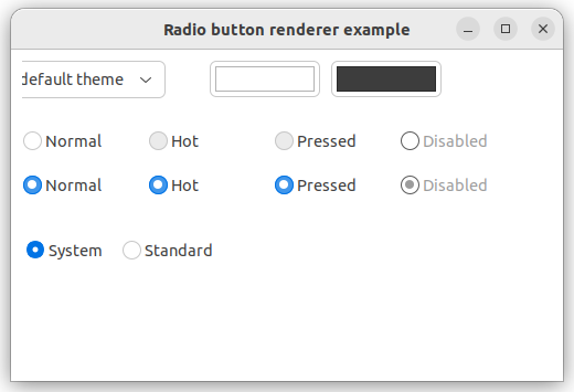
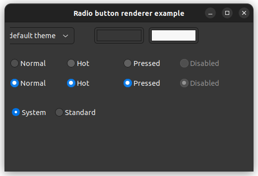
radio_button_renderer.cpp
demonstrates the use of xtd::forms::radio_button_renderer control.
- Windows
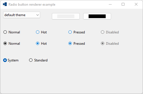
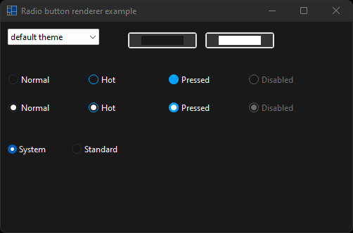
- macOS
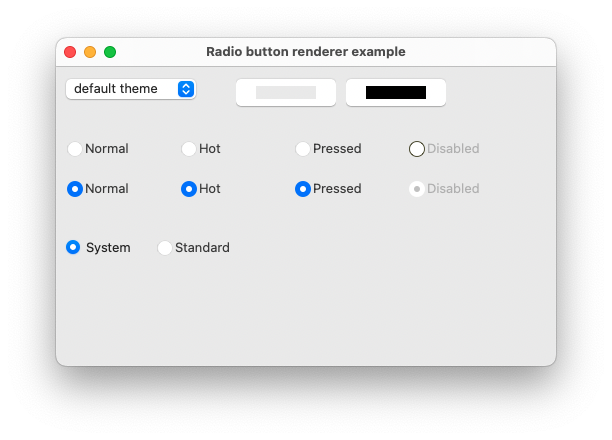
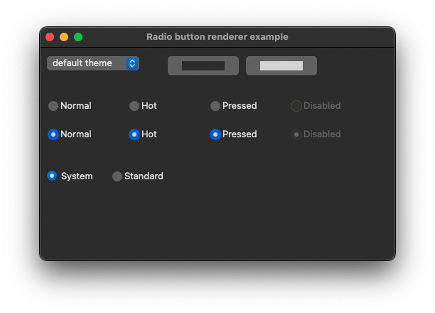
- Gnome
#include <xtd/xtd>
namespace radio_button_renderer_example {
class form1 : public form {
public:
form1() {
text("Radio button renderer example");
client_size({500, 300});
set_color(color::blue);
set_color(nullptr);
choice_theme.parent(*this);
choice_theme.location({10, 10});
choice_theme.items().add("default theme");
auto names = application::style_sheet_names();
names.sort();
choice_theme.items().add_range(names);
choice_theme.selected_index(0);
choice_theme.selected_index_changed += delegate_ {
application::style_sheet(choice_theme.selected_index() == 0 ? application::system_style_sheet() : application::get_style_sheet_from_name(choice_theme.selected_item().value()));
color_picker_background.color(back_color());
color_picker_foreground.color(fore_color());
bcolor.reset();
fcolor.reset();
radio_button_system.back_color(nullptr);
radio_button_system.fore_color(nullptr);
radio_button_standard.back_color(nullptr);
radio_button_standard.fore_color(nullptr);
};
color_picker_background.parent(*this);
color_picker_background.location({180, 10});
color_picker_background.color(back_color());
color_picker_background.color_picker_changed += delegate_ {
bcolor = color_picker_background.color();
radio_button_system.back_color(bcolor.value());
radio_button_standard.back_color(bcolor.value());
};
color_picker_foreground.parent(*this);
color_picker_foreground.location({290, 10});
color_picker_foreground.color(fore_color());
color_picker_foreground.color_picker_changed += delegate_ {
fcolor = color_picker_foreground.color();
radio_button_system.fore_color(fcolor.value());
radio_button_standard.fore_color(fcolor.value());
};
radio_button_system.parent(*this);
radio_button_system.checked(true);
radio_button_system.flat_style(xtd::forms::flat_style::system);
radio_button_system.location({10, 170});
radio_button_system.text("System");
radio_button_standard.parent(*this);
radio_button_standard.location({100, 170});
radio_button_standard.text("Standard");
}
protected:
void on_paint(paint_event_args& e) override {
form::on_paint(e);
radio_button_renderer::draw_radio_button(e.graphics(), {10, 70, 104, 25}, "Normal", font(), xtd::forms::text_format_flags::vertical_center | xtd::forms::text_format_flags::left, xtd::drawing::image::empty, {0, 0, 0, 0}, false, xtd::forms::visual_styles::radio_button_state::unchecked_normal, bcolor, fcolor);
radio_button_renderer::draw_radio_button(e.graphics(), {124, 70, 104, 25}, "Hot", font(), xtd::forms::text_format_flags::vertical_center | xtd::forms::text_format_flags::left, xtd::drawing::image::empty, {0, 0, 0, 0}, false, xtd::forms::visual_styles::radio_button_state::unchecked_hot, bcolor, fcolor);
radio_button_renderer::draw_radio_button(e.graphics(), {238, 70, 104, 25}, "Pressed", font(), xtd::forms::text_format_flags::vertical_center | xtd::forms::text_format_flags::left, xtd::drawing::image::empty, {0, 0, 0, 0}, false, xtd::forms::visual_styles::radio_button_state::unchecked_pressed, bcolor, fcolor);
radio_button_renderer::draw_radio_button(e.graphics(), {352, 70, 104, 25}, "Disabled", font(), xtd::forms::text_format_flags::vertical_center | xtd::forms::text_format_flags::left, xtd::drawing::image::empty, {0, 0, 0, 0}, false, xtd::forms::visual_styles::radio_button_state::unchecked_disabled, bcolor, fcolor);
radio_button_renderer::draw_radio_button(e.graphics(), {10, 110, 104, 25}, "Normal", font(), xtd::forms::text_format_flags::vertical_center | xtd::forms::text_format_flags::left, xtd::drawing::image::empty, {0, 0, 0, 0}, false, xtd::forms::visual_styles::radio_button_state::checked_normal, bcolor, fcolor);
radio_button_renderer::draw_radio_button(e.graphics(), {124, 110, 104, 25}, "Hot", font(), xtd::forms::text_format_flags::vertical_center | xtd::forms::text_format_flags::left, xtd::drawing::image::empty, {0, 0, 0, 0}, false, xtd::forms::visual_styles::radio_button_state::checked_hot, bcolor, fcolor);
radio_button_renderer::draw_radio_button(e.graphics(), {238, 110, 104, 25}, "Pressed", font(), xtd::forms::text_format_flags::vertical_center | xtd::forms::text_format_flags::left, xtd::drawing::image::empty, {0, 0, 0, 0}, false, xtd::forms::visual_styles::radio_button_state::checked_pressed, bcolor, fcolor);
radio_button_renderer::draw_radio_button(e.graphics(), {352, 110, 104, 25}, "Disabled", font(), xtd::forms::text_format_flags::vertical_center | xtd::forms::text_format_flags::left, xtd::drawing::image::empty, {0, 0, 0, 0}, false, xtd::forms::visual_styles::radio_button_state::checked_disabled, bcolor, fcolor);
}
private:
void set_color(const color& color) {
cdebug << string::format("color = {}", color.to_string()) << environment::new_line << std::flush;
}
void set_color(nullptr_t) {
cdebug << "color = (nullptr)" << environment::new_line << std::flush;
}
std::optional<color> bcolor;
std::optional<color> fcolor;
choice choice_theme;
color_picker color_picker_background;
color_picker color_picker_foreground;
radio_button radio_button_system;
radio_button radio_button_standard;
};
}
auto main() -> int {
application::run(radio_button_renderer_example::form1 {});
}
static image empty
Represent an empty xtd::drawing::image.
Definition image.hpp:65
#define delegate_
The declaration of a delegate type is similar to a method signature. It has a return value and any nu...
Definition delegate.hpp:1018
@ vertical_center
Centers the text vertically, within the bounding rectangle.
Definition text_format_flags.hpp:36
@ left
Aligns the text on the left side of the clipping area. This is the default.
Definition text_format_flags.hpp:28
@ unchecked_normal
The radio button is unchecked.
Definition radio_button_state.hpp:26
@ checked_normal
The radio button is checked.
Definition radio_button_state.hpp:34
@ checked_disabled
The radio button is checked and disabled.
Definition radio_button_state.hpp:40
@ unchecked_pressed
The radio button is unchecked and pressed.
Definition radio_button_state.hpp:30
@ checked_hot
The radio button is checked and hot.
Definition radio_button_state.hpp:36
@ unchecked_hot
The radio button is unchecked and hot.
Definition radio_button_state.hpp:28
@ unchecked_disabled
The radio button is unchecked and disabled.
Definition radio_button_state.hpp:32
@ checked_pressed
The radio button is checked and pressed.
Definition radio_button_state.hpp:38
@ system
The appearance of the control is determined by the user's operating system.
Definition flat_style.hpp:32
Generated on for xtd by Gammasoft. All rights reserved.