
|
xtd
1.0.0
|
Loading...
Searching...
No Matches
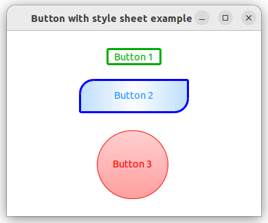
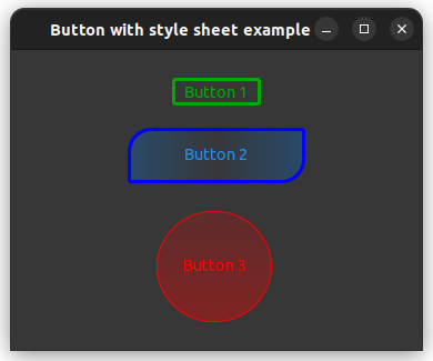
button_with_style_sheet.cpp
demonstrates how to create a xtd::forms::button control with style_sheet.
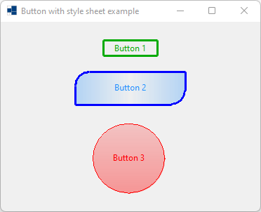
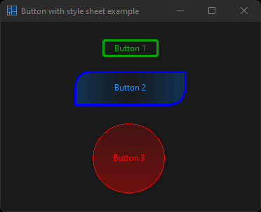
- Windows
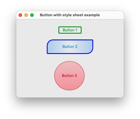
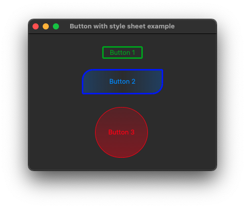
- macOS
- Gnome
#include <xtd/xtd>
namespace button_with_style_sheet_example {
class form1 : public form {
public:
form1() {
button1.location({145, 25});
button1.size({80, 25});
button1.text("Button 1");
button1.style_sheet(R"(
button {
border-style: solid;
border-color: #00AA00;
color: #00AA00;
}
button:hover {
border-color: lime;
color: lime;
}
button:pressed {
border-color: #55FF55;
background-color: green;
color: #55FF55;
}
)");
button2.location({105, 70});
button2.size({160, 50});
button2.text("Button 2");
button2.style_sheet(R"(
button {
border-style: solid;
border-color: blue;
border-radius: 20px 0px 20px 0px;
background-image: linear-gradient(to left, rgba(0, 128, 255, 0.251), rgba(0, 128, 255, 0.008), rgba(0, 128, 255, 0.251));
padding: 1px 1px 3px 1px;
color: dodgerblue;
}
button:hover {
color: #69B5FF;
}
button:pressed {
background-image: linear-gradient(to left, rgba(0, 128, 255, 0.5), rgba(0, 128, 255, 0.128), rgba(0, 128, 255, 0.5));
color: #69B5FF;
}
)");
button3.location({25, 145});
button3.size({320, 100});
button3.style_sheet(R"(
button {
margin: 0px 0px 0px 33vw;
border-style: solid;
border-color: red;
border-width: 1px;
border-radius: 50vh;
background-image: linear-gradient(rgba(255, 0, 0, 0.188), rgba(255, 0, 0, 0.376));
padding: 1px 1px 3px 1px;
color: red;
width: 100vh;
}
button:hover {
border-style: outset;
color: #FF5555;
}
button:pressed {
border-style: inset;
background-image: linear-gradient(rgba(255, 0, 0, 0.251), rgba(255, 0, 0, 0.5));
color: #FF5555;
}
)");
button3.text("Button 3");
text("Button with style sheet example");
client_size({370, 270});
controls().add_range({button1, button2, button3});
}
private:
button button1;
button button2;
button button3;
};
}
auto main() -> int {
application::run(button_with_style_sheet_example::form1 {});
}
Generated on for xtd by Gammasoft. All rights reserved.